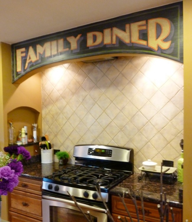
Moving on to the kitchen area in my client’s home, we finished up (for now anyhoo) the antique signage projects on the list this week. Above is the arch over the range that just cried out for some fun details to frame the area. After tossing a few ideas around, we came up with a plan and I set to work planning out the kitchen arch lettering and colors to really make it sing. While I was working, I took a break every now and then to snap a few photos, so you could see how a painting like this comes together.
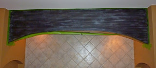
Yesterday, I taped the whole archway off, and painted in the base coat artwork, going for an old wood sign look with some of the paint faded and weathered away. I had another small project to work on at the same time and got that one done that same day.
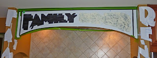 Today, I set up the lettering mask I had made and cut it out right on the wall. This is a great way to do lettering, creating a one time use stencil, removing and replacing sections as needed to mask off different areas.
 I painted a mottled cream base coat for both the letters and their shadows, and did a bit of a frame around the kitchen arch lettering to complete the look.
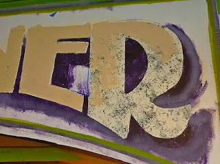 A quickly and artistically applied deeper beige allows some of the cream to show through, giving it a weathered look.
Each letter got a lovely pumpkin colored outline to really make it pop against the weathered black and deep purple shadows. Notice the green frame around the sign to bring the greens over from the dining area.
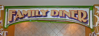 Ta-da! Kitchen arch ettering all painted in, ready to remove the masking and do any touch up needed before letting the colors dry for a bit.
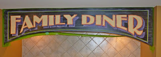 Masking removed! Looks great so far, the antiquing glaze- good old ‘Decades of Grime’ will tone the colors down, and that’s what I want.




Great job documenting with the photos! Love seeing the process!